

From the archive · 2020
Success Partners · Agriculture & Agribusiness
Daiminta Fertiliser Range
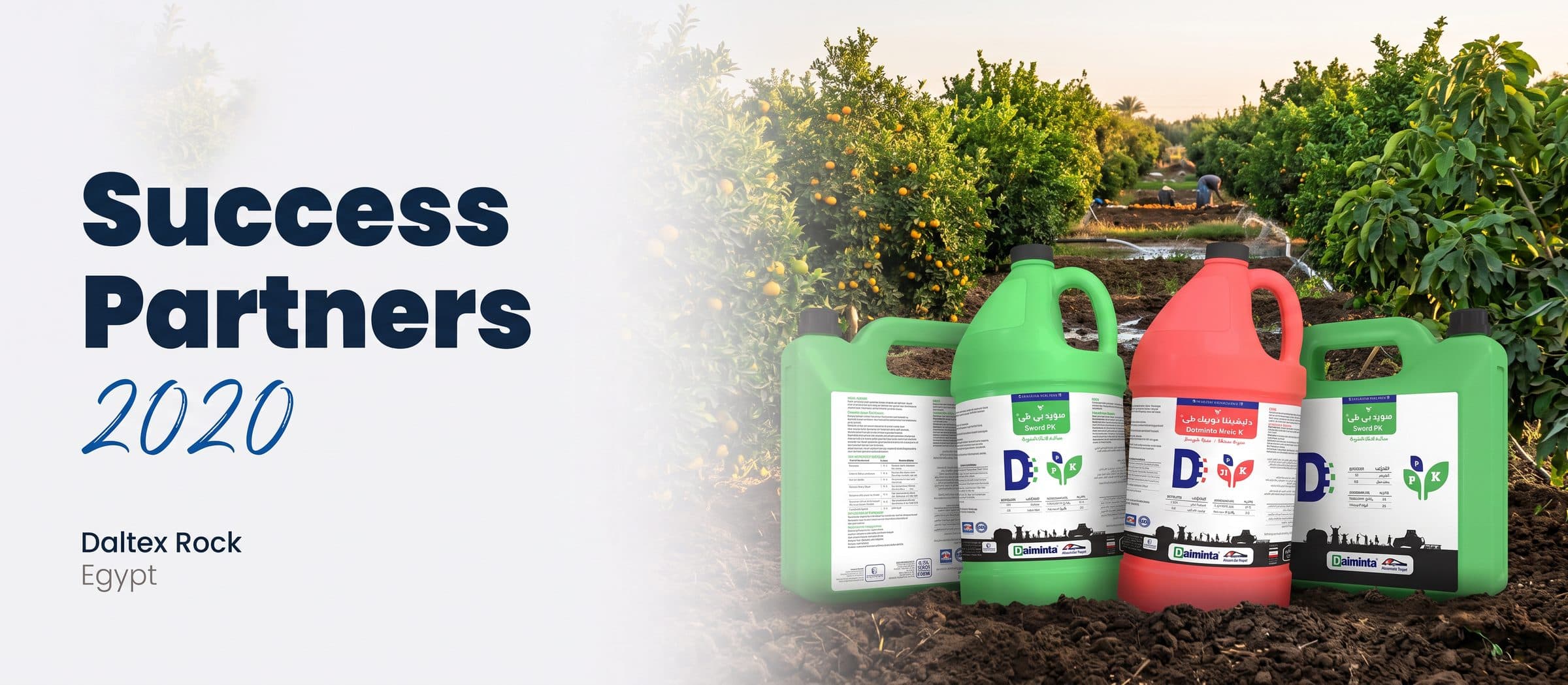
A liquid-fertiliser range from Daltex Rock. We built the brand mark and a bilingual label system for five products, colour-coded so a farmer knows what each bottle does at a glance.
- 🇪🇬 Egypt · Agriculture
- ✳️ Brand mark + label system
- 🧪 5 products, Arabic & English
- 5
- Products in one label system
- 3
- Colour-coded product families
- 2
- Languages on every label
- 1 slogan each
- e.g. 'Bigger size, more sugar'
Colour that reads before words
Fertiliser labels are crowded by law: composition, dosage tables by crop, compatibility, storage and safety — in two languages. On a busy store shelf, none of that helps a farmer pick the right bottle.
So the system does the first job with colour and the second with structure. Each family has its colour and banner — Harvest Completers, Defense Inducers, Tonic Complex — and a big nutrient icon on a leaf shows what is inside. The technical detail stays, organised into the same grid on every product.
How we built it
- 1
A 'D' that grows
The Daiminta mark is a bold D with a trail of pixels — a field being planted row by row.
- 2
Families by colour
Red for harvest completers, green for defence inducers, orange for the tonic — one glance tells the job.
- 3
A promise per product
Short slogans turn chemistry into benefits: 'Bigger size, more sugar', 'Superb protection', 'Easy feed for rapid effect'.
- 4
Rooted in the field
A silhouette of farmers and tractors runs along the base of every label, tying a technical product to the people who use it.
Packaging
The labels on 1-litre jugs and 5-litre canisters.
The label system
All five products, flat — the same grid, a different colour and promise for each.
Launching an agri product?
We design packaging and labels that sell on the shelf and stay clear in the field.
Archive project, 2020. The cover is an AI-generated scene built from the original packaging mockups.